
Most other representations, or map projections, are biased. Bias means that prejudice is shown for or against someone or something unfairly. An example: you have been friends with someone since Kindergarten and then another classmate tells you that your friend stole a book from his locker, you might not want to believe the classmate. That might be because you are biased for your friend. Likewise, if you hear from a classmate that the kid who always makes mean comments to you under her breathe in class stole a book from his locker, you might believe it. You are biased against the bully.
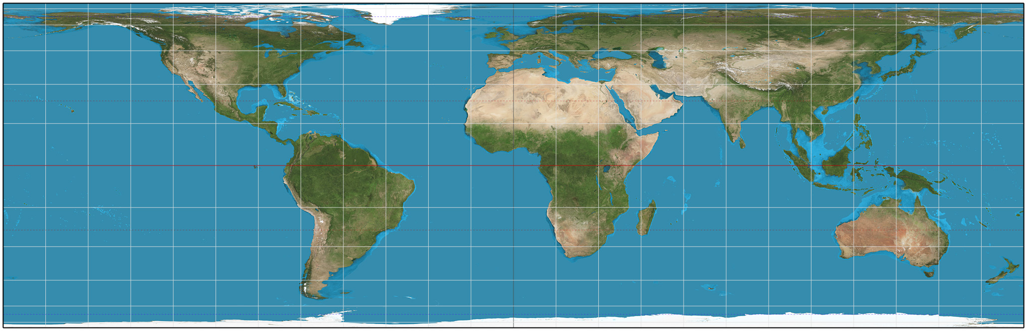
Now let's look at map projections. We will start with the Mercator Projection. It is a map projection that we have seen time and again. It's popular with publishers, and so it ends up on many classroom walls.
Mercator Projection

We want to look at a few things (these are on your grid):
- Are the lines of latitude and longitude equidistant on the map? Equidistant means equal distance. (So, latitude and longitude makes a grip on the map. Are all the squares on the map the same size? A good way to tell quickly, is use your finger to roughly measure the height of one square at the equator and compare are you make your way towards one of the poles. Are they the same size?
- Compare the size of the continents on this map to those on a globe. What do you notice? What is too big? What is too small? Or what is just the right size? Give three examples....then....
- Is this map projection biased? If there are quite a few things that are distorted (misshapen or the wrong size), then the answer is YES! If things look about the right size, then the answer is NO!
- We will decide, later, whether the map is trustworthy or not based on this information.
- Answer the question if the coordinates are equidistant. Are they? Take a look. The squares at the equator look small when compared to those closer to the poles. So the answer is: NO!
- Now we are trying to determine whether the map is biased. So let's look at some different areas of the globe.
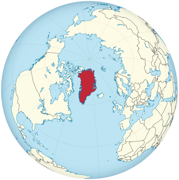
- Let's start with Greenland. Look at it's size on the globe below. Compare that to the projection above. Greenland looks HUGE on the projection, but small on the globe. Write that as an example.
- Let's go to Africa. Look at it's size on the globe below and compare to the projection. Africa looks teeny tiny on the map when compared to the globe. Write that as an example.

- Look at Antarctica. Look at it's size on the globe below and compare to the projection. Antarctica looks like it could gobble up South America on the map, but it's not so big on the globe. Is it? Write that down as your third example.

- Is the map biased? You now have three examples. What do you think? Is it a fair representation of the Earth? If not, then the map is biased and you would write: YES. If the map made the land masses look about the same as on the globe, then the map is not biased, and the answer would be: NO.
Now, grab a globe, and fill out the grid for the following map projections:
Robinson Projection

Peters Projection

Goode Projection

Lambert Projection
No comments:
Post a Comment